How I use figma for collaborative graphic design
Polici, a start-up I’ve worked in for two years, will be closing shop soon, but I want to reflect on my experience as its Creative Director. One of the main objectives I was tasked with was to lead the design team to create newsletter content. All of this happened during COVID, so we were working in isolation. We used to work in illustrator and then on Sunday, we just combine the graphics together into one newsletter piece. But I thought that it was hard to ensure that the aesthetics were uniform. That's why I decided to change to Figma, another design program that allows for better cooperation between designers.
I will not go into detail how figma works, but I will highlight some good features that allowed us to coordinate better.
Iteration #1

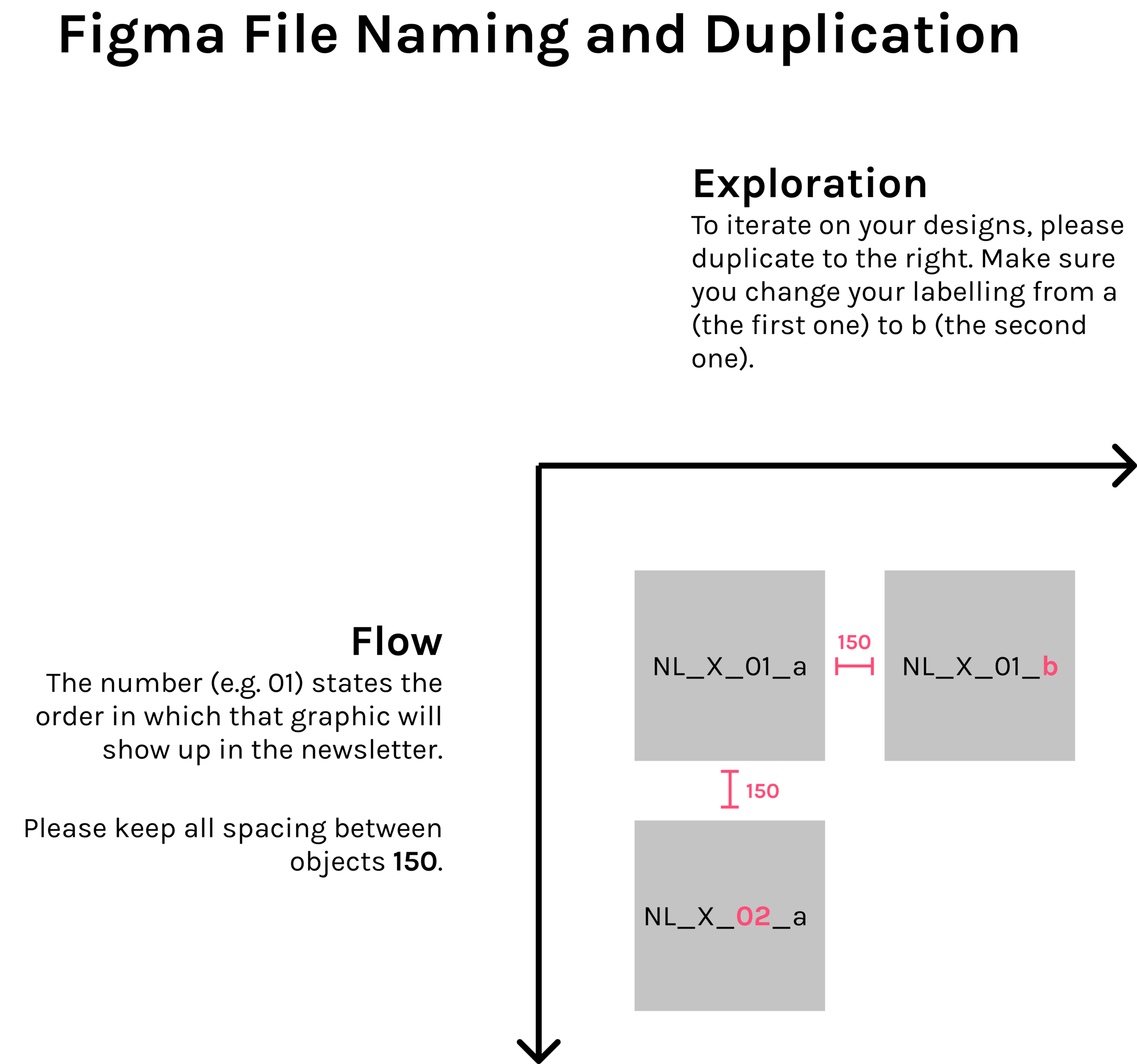
In the first iteration, I laid out the 'frames' in the way that reflect the actual newsletter. New graphics are laid out vertically, while new versions of the same graphic are laid out horizontally.

The designers' names are laid out on the left so that we have a visual sign of which graphic a designer needs to work on.

Local Styles
The good thing about Figma is that you can create "local styles'' which other designers can use as well.
Here, I set some premade styles in terms of fonts and colors so that my partner can also copy the style I used for my own graphics. This way, our graphics will come out looking more coherent as a whole.
Iteration #2

In this iteration, we started playing around with color palettes. We also standardized the frame dimensions to be 1:1, so that they can be used in an instagram post as well as in the newsletter.
On the left, you will see the color palettes set in place, so that designers know which colors to use. Because of this, even though there are four different designers, all of them come out in the same style.
For the name tag, we also had the content and the name of the content writer so that we know who to contact when asking for feedback on our graphics.
Iteration #3

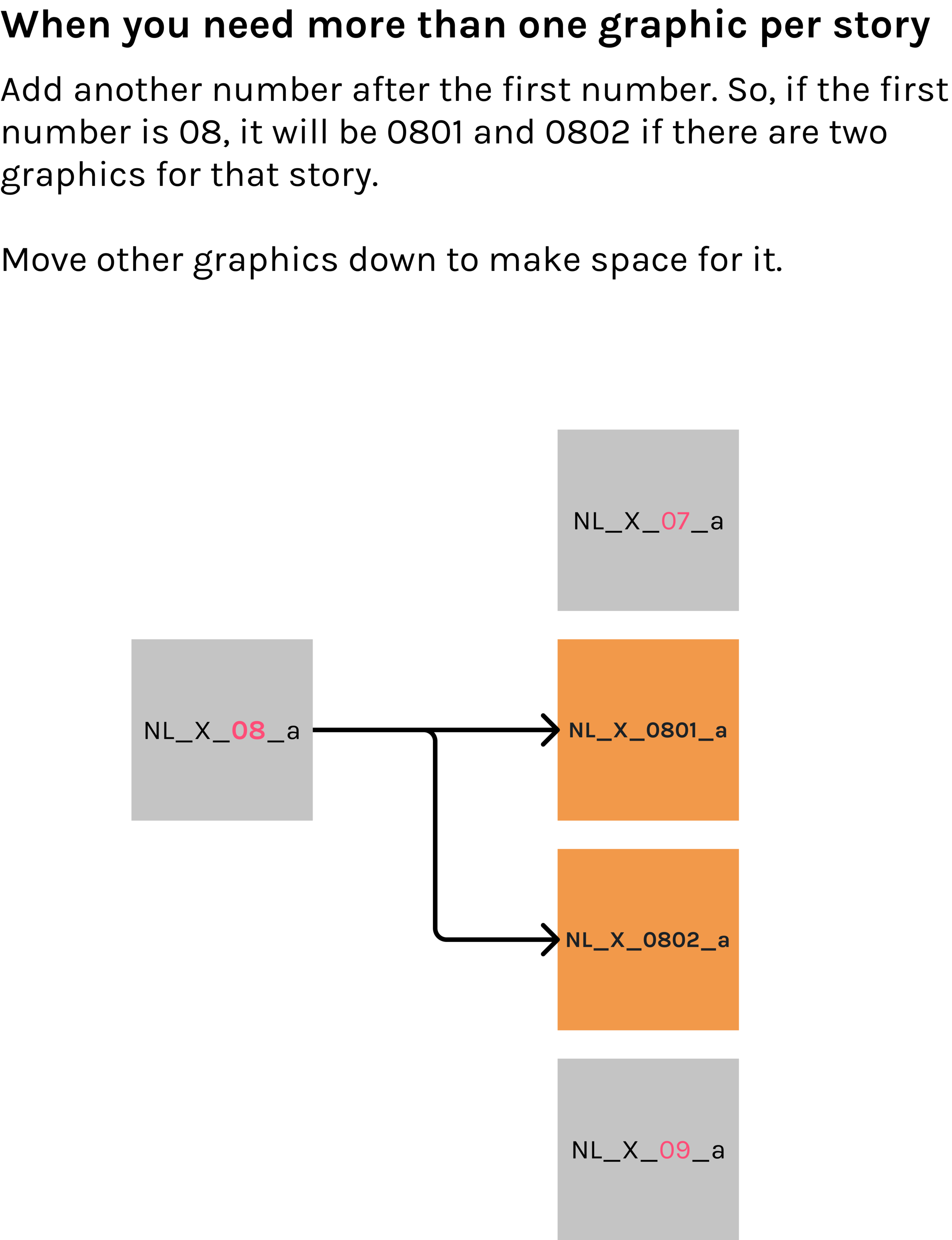
In this iteration, we started becoming more organized. Firstly, on the left, a color palette of five colors is set by one of the designers. We are only allowed to use those five colors. Below the color palette are some instructions set on how to name the frames.
Beside the graphics, we have tiny cards that show who the content writer for that graphic is as well as its designer. The bars under those cards are status bars to show where we are. Red means that it has not been started, while green means that it is completed.

We made one empty copy so that we can duplicate them for every week.
Iteration #4

In the fourth iteration, things started to become more colorful. On the left side, there's a guide on how to import an excel graph into Figma.
There's also a variation of the color palette. Here, a dark background is chosen and the stars under each palette indicate how well that color will stand out on the dark background.

We also have another card attached to the name card that estimates how long each graphic will take. It's helpful for us college students as we need to divide our time among our own school work as well. This time estimate indicates how long this assigned type of graphic will take based on past experience.

The centerpiece of it all is probably our components library. This is a separate file from all the newsletter material. But Figma allows us to share the components made in this file and use them in any of the files in our workspace. It's very convenient because we only need to make a certain component once. This saves us a lot of time.

Project Reflection
Did I waste time going down any dead ends?
I don't think so. Even if I did, I don't think that this type of process is something you can plan from the start. Planning is good to a certain degree but in an uncertain environment, especially when you work with other people, I think that trying things through trial and error yields a more optimized result. The inefficiencies and confusions of past versions are corrected with the next iteration.
Did I choose the right technology?
Figma was definitely the right choice. For someone who has not used illustrator before, learning Figma might actually be a steep learning curve. But since all my teammates are proficient with illustrator, the switch over was not too difficult. I had to try to convince them to do everything on Figma by holding some workshops, but in the end, I think that everyone was content doing their work on this new platform.
Did I accurately estimate the time required for each week's newsletter?
The process can definitely be faster, but there's a lot of uncertainty working across different time zones and with other teams other than the design team as well. Since we did so many of these newsletters, we were able to come up with a rough estimate for how long each type of graphic would take though.
Overall Impression
I really enjoyed the process of iterating over different processes to facilitate our design team working together. I learned that creating a plan from the very beginning might not be a sustainable way to go. For these types of things, I should reflect on previous weeks, ask for feedback from my teammates and then act accordingly to those feedback.