Reflection on my own work at Polici
I’ve been wanting to reflect upon my own contributions to a start-up I worked for named Polici. Most of the work I did there was related to editing, finding data and creating graphics for our weekly newsletter. Here are some of the newsletters I felt proud of.
While I did not make all the graphics in these newsletters, all of them were under my creative direction.
Secret Formula: Voter Turnout (November 23, 2020)
We were thinking of creating a newsletter to explain the after-effects of the 2020 election. In this issue, we compared data from the 2020 election to the 2016 one; what we found was that in many states, turnout rate has increased.

There were plenty of cartographic representations of the US map during the election, but I thought that there wasn’t one that allows you to compare states easily regardless of state size. There, my friend Olivia and I decided to go with a hex map where all states are represented with equal-size hexagons that are arranged into the shape of the United States. This way, one can compare the states easily and may even find it easier to find one’s own state.

In the equation graphic, I wanted to maintain the formal vibe that we got from the research paper we were reading on the turnout rate model, so I decided to keep the formal-ish font of math textbooks while using our signature style to annotate what the formula means.


This issue was one where I had more control over the graphics. Before this issue, we mostly focused on US politics, diving deep into explaining concepts such as the Supreme Court and the electoral college. However, with an abundance of explanations that already existed out there related to these topics, I thought that our audience probably felt like these topics were already saturated. To confirm hunch, I went to look at our instagram page and the engagement statistics for our newsletter. What I found was that our audience, most of them being college students, are more interested in data related to relatable everyday topics such as streaming and social media. This issue was one of the first of many issues where we pivoted to covering more topics that college students would be interested in.
In this issue, we mostly looked at streaming preferences and what kind of shows were popular. In the graphic “What Americans Are Watching,” it was easy to lean towards bar charts to just map out the most popular shows at that time (November 2020), but I felt like our newsletter should differentiate ourselves somehow from other data-viz newsletters. So here, I took a more manual approach where I first generated the bar chart on excel before importing it into Figma. I was inspired by the graphics-heavy approach Netflix has to entice viewers to pick their show, so I went with the main characters from each of the shows and put it under the bar chart, so that people can see right away what each show is even without reading the title.
This graphic turned out to do very well on our instagram page, confirming that we are going down the right direction.


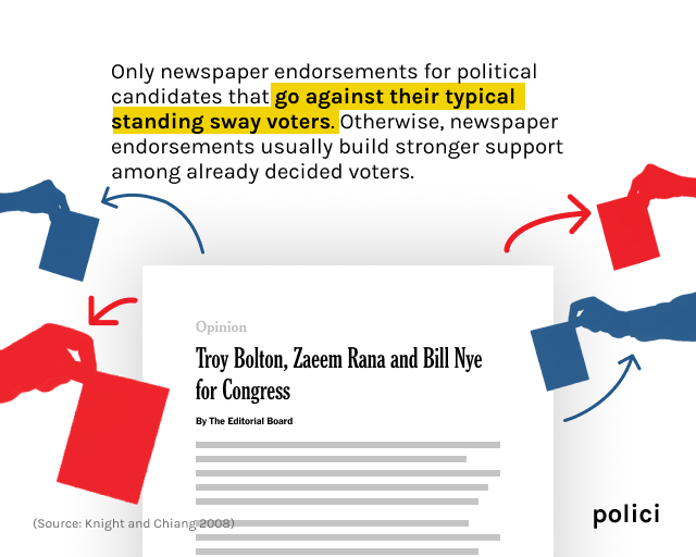
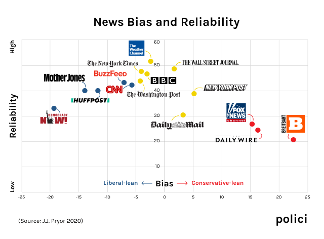
This was the issue we sent out on Election day. We wanted to look at how the media was covering the election, so we mostly focused on that aspect. On top of this, we wanted to find whether there was a new angle to the topic that has already been covered thoroughly elsewhere by large media companies. What we did was to look at historical data and papers on the topic. What resulted was a newsletter related to the influence of the media on the election outcome.