Conurbation Visualization: US Census
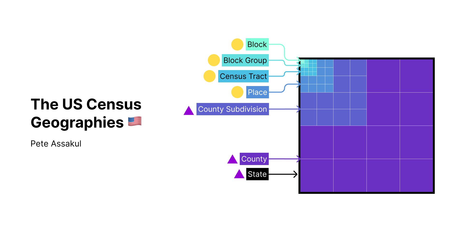
This is the project where I try to visualize the complex composition and relationships of US Census Geography. The result is an interactive non-linear presentation.
The process was done iteratively through feedback from both planners and non-planning audiences. The point of the presentation was to present the material in the simplest form possible (should be simple enough that even if you cannot read English, you should be able to grasp the relationship).
If you catch anything wrong with the content or found that it is difficult to understand the content, please leave me a comment 🙇🏻♂️.